tidedashboard: A web based GUI for viewing tide data in Ireland
Introduction
This project was intended as an exploration into the capabilites of shiny and interactive data visualisation. Going into the project I had some requirements for the end result of the GUI:
- Minimal, simple ui
- Intuitive method of selecting data
- Minimal time between selecting data and the data being plotted
- Data should be plotted in a scrollable, interactive time series plot
Results
The final result looks as follows (deployed at shinyapps.io):
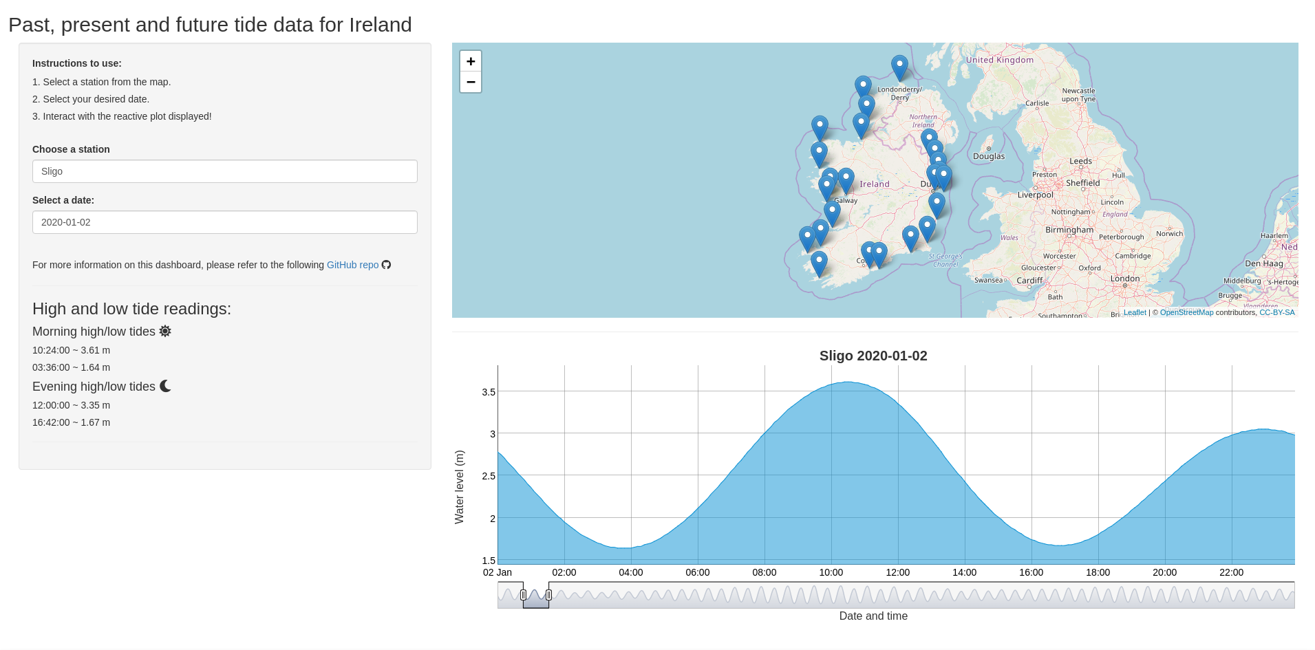
Clicking the screenshot will take you to the live version of the dashboard containing non-modelled data.
Methods
All of the tide data was obtained from the Marine institute in Ireland. All data prep was handled in a separate R script which you can find here. The entire dataset was subsetted first by whether the data was modelled or not, and second by location. This two step categorisation overcame the performance issues faced when loading the whole dataset at once. The end result is that a single small .rds file is only loaded at any one time, which corresponds to the location selected. Lastly, date and time data was transformed to xts format for compatibility with dygraphs.
The shiny app itself went through several revisions before ending up on a simple intuitive result. The final pipeline for data processing is handled by an observer and several reactives. The observer is required to register the location clicked on the map, and then the reactives produce the dataset to be plotted, depending on the day selected. By default, the current day is used. Source code for the app can found here.